
Corporate Identity and Typefaces
Page 1 of 1

Corporate Identity and Typefaces
![]() Quicksilver Fri Aug 22, 2008 4:35 pm
Quicksilver Fri Aug 22, 2008 4:35 pm
Before I let you on about the article, lets take a pop quiz!
Listed below are 25 logos of famous Indian/International brands. Go through and see how many can you identify.
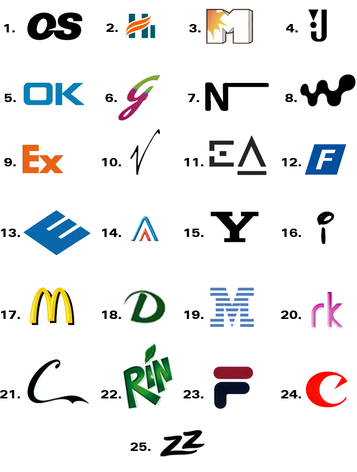
Ok. So how did you fare? Compare your answers with the true copy at the end of the article and rate yourself! But wait!! Continue with the flow of the article and wait just a little longer for the answers…
If you noticed all the ‘logos’ were nothing more than just fonts and not actual graphic elements. This is the latent power of fonts! A slight glimpse of the brand name and you come to know about the product they manufacture and the consumers they target. In fact a few logos let on even more information than what meets the eye. With this point in mind I’d like to draw your attention to two logos in particular:
Logo 9: The ‘E’ and the ‘x’ have been brought close to form an arrow between the letters.
Logo 14: This part of the whole logo not only makes the whole logo more appealing on the whole but also gives you the initials of the owner!!
What I want to draw your attention to is that logos need not be a graphic element; even a unique typeface (i.e. font) will suffice. Study of typefaces is called as Typography. Sounds like a bore? Well… the results that can be produced just by using typefaces are simply amazing. Not only do fonts uphold corporate identity but they also give a ‘flavor’ to the reading content. Fonts can unconsciously make readers aware of the content of the text before they read and also influence their mood. For example, have a look below:
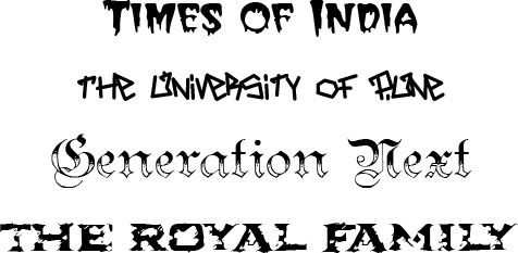
What you have above is a cocktail that could spawn the World War III. Therefore whether printing or designing give thought to the font that you use - don’t just use ‘comic sans MS’ because “It looks so warm and friendly” - Guys grow up! All typefaces have their own places – put them in their rightful places.
The answers :
1. Microsoft 2. Himalaya 3. MTv 4. JBL 5. NOKIA 6. Godrej 7. Nestle 8. Walkman
9. FedEx 10. Virgin 11. Creative 12. FIAT 13. DELL 14. Reliance 15. SONY 16. Disney
17. McDonalds 18. Dabur 19. IBM 20. Orkut 21. Coca Cola 22. Mirinda 23. Fila 24. Canon
25. Pizza Hut
Listed below are 25 logos of famous Indian/International brands. Go through and see how many can you identify.
Ok. So how did you fare? Compare your answers with the true copy at the end of the article and rate yourself! But wait!! Continue with the flow of the article and wait just a little longer for the answers…
If you noticed all the ‘logos’ were nothing more than just fonts and not actual graphic elements. This is the latent power of fonts! A slight glimpse of the brand name and you come to know about the product they manufacture and the consumers they target. In fact a few logos let on even more information than what meets the eye. With this point in mind I’d like to draw your attention to two logos in particular:
Logo 9: The ‘E’ and the ‘x’ have been brought close to form an arrow between the letters.
Logo 14: This part of the whole logo not only makes the whole logo more appealing on the whole but also gives you the initials of the owner!!
What I want to draw your attention to is that logos need not be a graphic element; even a unique typeface (i.e. font) will suffice. Study of typefaces is called as Typography. Sounds like a bore? Well… the results that can be produced just by using typefaces are simply amazing. Not only do fonts uphold corporate identity but they also give a ‘flavor’ to the reading content. Fonts can unconsciously make readers aware of the content of the text before they read and also influence their mood. For example, have a look below:
What you have above is a cocktail that could spawn the World War III. Therefore whether printing or designing give thought to the font that you use - don’t just use ‘comic sans MS’ because “It looks so warm and friendly” - Guys grow up! All typefaces have their own places – put them in their rightful places.
The answers :
1. Microsoft 2. Himalaya 3. MTv 4. JBL 5. NOKIA 6. Godrej 7. Nestle 8. Walkman
9. FedEx 10. Virgin 11. Creative 12. FIAT 13. DELL 14. Reliance 15. SONY 16. Disney
17. McDonalds 18. Dabur 19. IBM 20. Orkut 21. Coca Cola 22. Mirinda 23. Fila 24. Canon
25. Pizza Hut

Quicksilver- Number of posts : 36
Age : 36
Location : Pune, Maharashtra, India
Branch : Computer Engineering
Registration date : 2008-08-08
Page 1 of 1
Permissions in this forum:
You cannot reply to topics in this forum|
|
|

